A Personalized Guide to the Incredible You
By Scott Andress, Director of Product Design at 23andMe
Your 23andMe results have arrived. The day you’ve been waiting for is here. It’s the culmination of curiosity, mystery — even trepidation. What will you find out about yourself and your family? The answers are just one click away.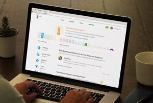
This is a pivotal moment for our customers – and this is where we first placed ourselves as product designers. How can we help people navigate through a rich forest of hundreds of thousands of genetic markers and show them the ways their genes make them truly unique?
The opportunity
Designing a consumer product powered by complex genetic information is challenging. 23andMe provides customers with deeply personal insights into themselves and their families. Access to this knowledge is useful, interesting, and fun, but it can also be sensitive. As product designers, we strive to create a customer experience that presents a wide range of information with a clear, approachable, and human tone.
 Late last year, we launched the new 23andMe experience, making us the first and only direct-to-consumer company to offer reports that meet FDA standards for scientific and clinical validity. Building on what we learned from earlier versions of our product, our objective was to design a more streamlined interface that would clearly present personalized information on carrier status, traits, and ancestry.
The new website design improved our product in many ways. Overall, streamlining the experience paid off by making genetic information easier to access and comprehend. But our homepage — the first thing our customers see when they log in to our service and the crossroad for our experience — was overly simplified and lacked key functionality. We knew we could do better.
Early this year, we took a fresh look at our homepage. Our goal was to create something that would guide customers through our services by providing meaningful and personalized information, while surfacing interesting activities to engage with. Here’s how we approached this project.
Our process
To kick off our project, we conducted a design sprint. For inspiration, we looked to the great foundations provided by the 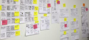
Day one of our sprints started with an intensive cross-functional collaborative session that included not just designers, but product managers, engineers, and scientists. Each team member brought their own experience, perspective, and data to the table so that we could paint a holistic picture of the possibilities and challenges at hand. After setting the stage and outlining the customer journey, we separated to individually create a broad range of potential solutions through rapid, low-fidelity sketches. Our goal was to generate and collect as many different concepts as possible. When we reconvened as a group, we critiqued, questioned, and ranked each concept. From there we decided which ideas were the top contenders to inform a design prototype that we would test with customers. Clear themes were beginning to emerge:
- Personalization is essential. Everyone is unique and their results should illustrate that. If we could create ways to personalize the experience, we would make our services feel more friendly, human and approachable.
- Easy navigation will enhance value. Some of our customers know exactly what they are looking for and just want a quick way to find it. Other customers aren’t sure what features are available to them. We should create a system that allows all customers to find what they are looking for, while also offering a way to discover new things they were previously unaware of. As customers go on their own individual journeys, they would benefit from recommendations for what to do next.
- Summarize and provide context. Ultimately our goal is to help customers better understand themselves through genetics. We should find ways to inform and educate our customers about how genetics influences their lives. Our job is to connect the dots and provide easy to understand take-aways.
Days two and three of our sprint focused on bringing these ideas together into a cohesive design for us to test. As the design team started to work through the concept sketches and notes from the previous day, organizing them according to themes and emerging principles, we started to see some patterns that indicated two possible directions.
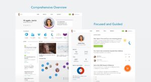 The first direction centered around a comprehensive overview that encouraged free-range exploration. In this model we would reveal almost everything available for the customer to explore, all on one dashboard. The other direction provided a more focused and guided experience, where we would provide some high-level information and focus on a personalized activity feed that would recommend what the customer could do next. After debating the merits of both ideas, we came to the conclusion that each direction had promise. We decided to rapidly design and prototype both models. Essentially, we kicked-off a UX bake-off, putting both designs up against each other to find the ultimate customer experience.
On days four and five we tested our design prototypes with current customers and with people who were not familiar with 23andMe. We learned a lot from these interviews. First, we found that both directions were perceived as an improvement over the current version. Good news — we were on to something! But instead of a singular winning direction, we learned that customers wanted the best parts of each design. Customers want clear and easy navigation, interesting take-aways and guidance on what to do next. We also relearned something that we had, admittedly, heard in previous studies – personalization doesn’t necessarily mean a prominently featured profile photo. “I already know what I look like! I don’t need to see my face at the top of the page,” is something we heard from more than one participant. Okay, no big profile photos — got it!
The outcome
Having a robust, clear, and well-grounded point of view is essential for meaningful product experiences. As designers and as a cross-functional product team, we should strive to be the experts of our product and formulate a vision for how it should evolve over time. A crucial part of this expertise is gained by becoming ardent advocates for our customers and understanding their points of view. Being open and receptive to their candid feedback is essential. A highly effective product team knows how to gauge and absorb feedback while thoughtfully incorporating it into the directional vision.
When done successfully, the result fulfills the customer’s desires and the overall goals for the product experience. This approach is especially important when designing for new and emerging experiences like personal genetics and consumer health products. These capabilities are so new to most people that it is our responsibility to show our customers what is possible, to educate them about the science and to guide them through the best ways to take advantage of what they learn.
 As our design sprint approached conclusion, we used our study findings to help us blend the best components from both directions into a single compelling design.
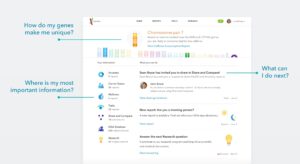
The final homepage design provides our customers with just three main elements: an interactive header that educates by providing context for results, quick navigation fortified with some basic summary information and a dynamic activity feed that recommends items to see and do. In other words, this page answers these questions for our customers; How do my genes make me unique? Where is my most important information? What can I do next?
Next, we started the hard work to bring the vision to life. For several weeks our product management and engineering teammates collaborated to build the functionality required to power the personalization and other new capabilities of the homepage. One key element was the new interactive header module. This was a big opportunity to provide valuable, personalized context and education to our customers. It was also a chance to incorporate our vibrant and friendly brand. Tuning this interaction to make it work well responsively — across desktop, tablet and phone browsers — was a big challenge. But the result is a great example of how a delightful interactive element can enhance the presentation of substantive information.
Before we made the new homepage available to all of our customers, we conducted a final series of tests with live traffic on our website to compare how well it would perform relative to the version it would replace. Overall, the results of this test showed us that customers spent more time on the new homepage and on the entire website each time they logged in. They also engaged with more reports and other key features compared to our original homepage. These findings demonstrated that our goal had been achieved. Our new homepage was a valuable guide for customers, helping them gain most from our services.
What’s next?
Our new personalized homepage advances our goal to provide customers with easy and straightforward access to their most important personal information — their own genetics. Customers can easily gain insights into how their genes make them unique. And the new homepage guides them with personalized recommendations to get the most from our service. But this is just the beginning of a continuously improving and expanding experience. The page will evolve as we learn more from our customers over time.
So what lies ahead for product design at 23andMe? After the success of our design sprint for the new homepage, we started to ask how we might take this thinking and apply it to other key features across our customer experience. Stay tuned — we’re working hard on some awesome new capabilities for the 23andMe service over the next few months.
Special thanks to Crystal Shei, Diane Wei, Caitlyn McCarthy, Gloria Lin, and Susan Furest on our product design team, as well as Sooyun Choi and our brand and marketing team, for bringing their talents and insights to this project. And a shout out to our cross-functional team across product management, science, consumer insights, analytics and engineering for enthusiastically embracing the design sprint process and for collaboratively driving this project from concept to reality.


