By Joe Banks, 23andMe Tech Lead
Editor’s note: This post by 23andMe’s Joe Banks, first appeared on 23andMe’s engineering blog. We’re reprinting an excerpt of it here to highlight issues around online accessibility and ideas for improving it. You can see the full version here.
I have a disability. Two, actually.
I was diagnosed with Usher Syndrome Type 2A, a rare genetic disease characterized by hearing loss and progressive vision loss.
When I was 3, my parents discovered that I was born with moderate-severe hearing loss in both of my ears. I was fitted with a pair of hearing aids, devices that would allow me to finally understand and hear my family.
The vision loss has had more of a profound impact on my life. While I knew that I was going blind, it didn’t feel real to me until I was in my 20s. I started to bump into people more frequently, which was followed by a quick apology by me and a glaring stare by the one whose space I invaded. Driving became increasingly difficult. For the safety of others and myself, I stopped driving at age 25. A few years later, I would learn how to use a white cane.
My visual field has narrowed from 180 degrees of visual field to less than 10 degrees. At this point, I’m considered legally blind and someone who has low vision.

Today, I continue to do what I love: building websites — here at 23andMe I’m a tech lead writing the code that powers 23andMe’s website — and lifting heavy metal as well as enjoying the outdoors.
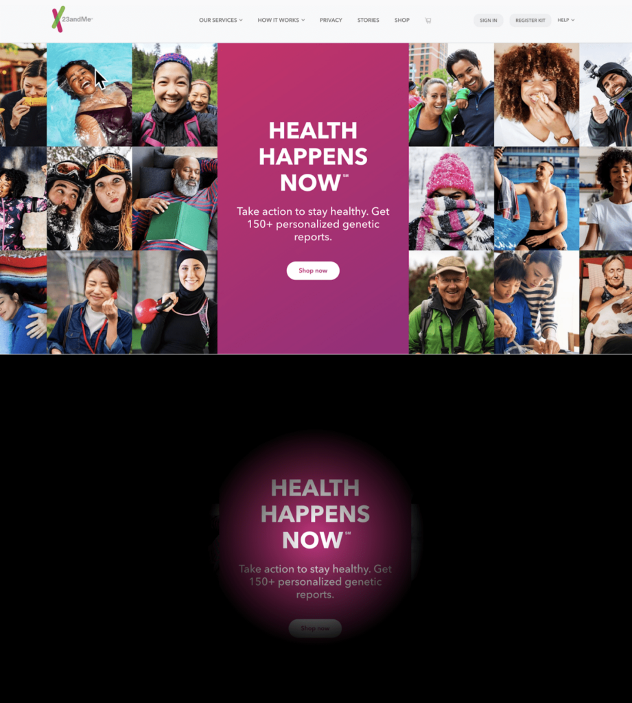
At work, I visually scan my computer screen with the vision I have left, increase the contrast and brightness of my screen, enlarge my mouse cursor, zoom in on smaller text, and use my keyboard as much as I comfortably can.
But even with these tools at my disposal, I run into issues that are difficult to overcome while browsing the web.
I’m sharing my experience both as someone with disabilities and as a tech lead at 23andMe, to highlight actions engineers, designers and others can take to fix the issues that exclude people with disabilities. The beauty of much of the technology today—like smartphones, computers, and the Web—is that they’re designed to be accessible to people with disabilities. Engineers, like me, who build on these platforms, have the responsibility to uphold this design, and not break it. Below are issues that I have personally experienced and steps engineers and web designers can take to fix these types of issues.
Accessibility issues that affect me
Low color contrast
I have enough functional vision to read text on a screen, but my sensitivity to contrast has diminished over time. I opt to increase the contrast and brightness on my computer screen, but that only can get me so far.
Low contrast text is a trendy design pattern, but it fails to consider how it affects people with low vision. Unfortunately, this practice is so popular that it ranks as the number one most common accessibility violation found in the WebAIM Million, an accessibility audit of the one million most-visited home pages on the web.
I tend to skip over text that has low contrast because it’s too much of a strain to read it. I know that others like me with low vision, have the same issues. It’s common for me to leave a website or trash an email if the content is too difficult to read. A simple and subtle change in contrast to the design could open all that content to others who are visually impaired.
It’s simple to first check the contrast and then fix it if it falls below the threshold that is visible to the people with low vision. To measure contrast ratio, you can use WebAIM’s contrast checker, or something similar. Enter the text color and background color, and the checker will tell you if the contrast ratio passes.
While testing for color contrast is easy, changing a color palette that’s been tied to a brand, like 23andMe, can be difficult. However, that isn’t an excuse to avoid the problem. After all, continuing to use a color palette that’s discriminatory to people with low vision is not good for a brand.
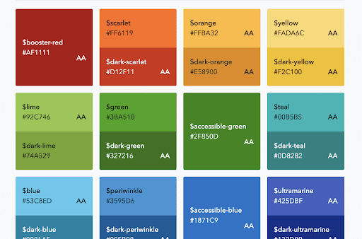
At 23andMe, our design system provides a color palette that indicates what colors meet the minimum color contrast (AA) set by the Web Content Accessibility Guidelines (WCAG). This shared knowledge ensures that designers and developers are on the same page when it comes to accessible color usage.

Inability to zoom
Another issue that people with low vision experience is the inability to magnify the text to make it more readable. Fixing that is also pretty straightforward by ensuring that the site isn’t restricting or disabling the zoom function.
No captions
While my hearing aids help me hear, they don’t completely restore my hearing. I’ll still miss words when listening to speech and I tend to subconsciously lip read when I’m talking to someone. When watching a video, I don’t always have the benefit of lip reading, so that’s when captions come in handy for me.
At 23andMe, we host our videos on YouTube. One of the great features of the platform is automatic captioning. This provides a quick and easy way for video authors to include captions in their videos. However, the quality of captions can vary, so it’s best practice to validate the captions in the video settings and make any corrections where needed. This ensures that the correct information is being communicated.
CAPTCHAs
I personally hate CAPTCHAs. Although they’re intended to prevent spam by distinguishing a human from a bot, for people with visual impairments are just another hurdle to accessing content. As someone with low vision, there’s nothing more frustrating than filling out a form and reaching a CAPTCHA where I repeatedly fail at scanning low-res photos for obscure objects. And what’s the alternative? Making out words in an audio track with distracting background noise? That’s also really difficult for me to accomplish with my hearing impairment.
I’m not alone. WebAIM’s 2017 screen reader survey respondents agree that CAPTCHAs are the number one most problematic issue they face on the web.
Determining if someone is a robot is a tough problem to solve and there isn’t a clear solution. Non-interactive solutions, like Google’s reCaptcha v3, are great for accessibility. However, since users are tracked, privacy rights need to be considered and handled appropriately. In addition, methods to handle ambiguous results need to also be accessible and effective at blocking bots. My hopes are that the solutions developed for CAPTCHA consider people with disabilities and don’t lock them out.
To learn more about the challenges with CAPTCHA and accessibility, check out W3C’s document on the Inaccessibility of CAPTCHA.
Moving forward
My journey with Usher Syndrome is still unfolding and I’m learning along the way. While I’ve accepted that this is my reality, I have an uneasy feeling about the current state of the web and what that means for my future. I’d like to continue being independent on the web, but I will need the help of the tech community to build experiences that I can continue to access and enjoy as my vision loss progresses.
In February 2020, WebAIM reevaluated the state of web accessibility for the top one million visited websites. Unfortunately, things have gotten worse since last year. Ninety-eight percent of the top million failed the accessibility audit. The kicker is that the audit only covered 30 percent of accessibility bugs.
This is a big problem. We need to do better. If we’ve learned anything from this pandemic, it is that access to the web whether it is for work, online learning, entertainment, or even simple social interactions is crucial for everybody.
At 23andMe, we’ve acknowledged this and have put an enormous effort towards making our digital experiences accessible. We’ve been working on educating colleagues about accessibility through talks, workshops, demos, online resources, and tickets addressing accessibility issues. Our design system requires components to be accessible and documents proper usage and accessibility considerations. To help prevent regressions, engineers are trained and provided documentation on how to evaluate accessibility with an automated scan, a keyboard, and a screen reader. The work continues, but we’re happy with the progress that we have made for our users.
I’ll end this with a few tips on getting started with accessibility. The breadth of accessibility topics can be pretty overwhelming, but starting somewhere is better than avoiding the problem.
Find where you can help and get involved
Accessibility is not just a front-end engineering problem.
If you have a role in making digital experiences that people use, then you should be familiar with how your decisions impact people with disabilities. For examples on how each role can contribute to accessibility, check out Accessibility for Teams and Accessibility for Teams by Google.
Learn about accessibility and share the knowledge
I started understanding accessibility when I began manually evaluating interfaces with a keyboard and a screen reader. I saw how bad the UX could be when accessibility is overlooked and how some features were completely unusable… and it was everywhere.
This prompted me to go back and re-evaluate how I was building websites. I browsed through WebAIM’s articles on accessibility, watched through Google’s online accessibility course and used the WCAG as a quick reference.
The point is, when you find out how you play a role in accessibility (see previous section), start digging into the topics where you can make the most impact.
Then, share that knowledge with your colleagues. At 23andMe, we’ve organized workshops, demos, meetings, and a company-wide presentation on a11y. In addition, we’ve curated documentation on a11y and created an #accessibility Slack channel where people can ask questions.
I invite you to start learning about accessibility and making the web a more inclusive place. At 23andMe, our mission is to help people access, understand and benefit from the human genome. We’re doing our best to include everyone in this pursuit. If you’d like to help us, please send feedback to our customer care team.
About the Author
Joe Banks is a tech lead at 23andMe and helps write the code for www.23andMe.com. He loves learning about new tech and aspires to make the Web more inclusive.


